
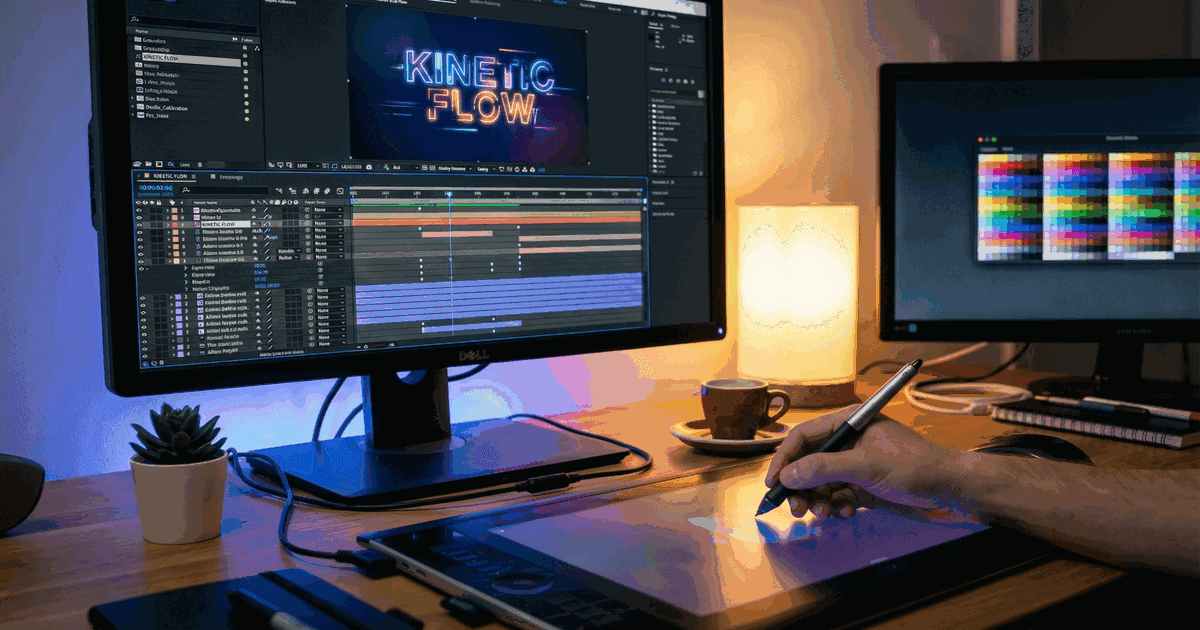
Good video with bad graphic design loses viewers before the message lands. A mismatched font, a cluttered lower third, or a color palette that fights the footage - these are the details that separate professional video from content that feels off without the viewer knowing why.
What is graphic design in video marketing?
Graphic design in video marketing refers to the visual elements layered onto or integrated within video content: thumbnails, title cards, lower thirds, end screens, motion graphics, text overlays, and ad creative frames. These elements determine whether someone clicks your video, stays watching, or scrolls past. Strong graphic design is the foundation of creative video ads that convert. According to YouTube's 2025 Creator Academy data, custom thumbnails with strong graphic design receive 73% more clicks than auto-generated frames. For paid video ads, Meta's 2025 Creative Best Practices report found that the first frame's graphic design accounts for 65% of an ad's performance variation.
Table of contents
- Why graphic design matters more in video than in print
- The 8 graphic design elements that affect video performance
- 15 graphic design examples from high-performing video campaigns
- Graphic design principles for each video format
- Common design mistakes that kill video engagement
- Tools and cost benchmarks for video graphic design
- How to evaluate graphic design quality in video content
- FAQ
Why graphic design matters more in video than in print
Print design gets evaluated slowly. Someone holds a brochure, flips through it, reads at their pace. Video design gets evaluated in milliseconds. A thumbnail has 1.6 seconds of attention before a viewer decides to click or scroll (Microsoft Attention Span Study, 2024). A video ad's opening frame has 0.4 seconds before the thumb reaches the skip button on mobile.
This time pressure changes how graphic design works:
Typography must be readable at small sizes. A 72-point headline that looks great on a poster becomes illegible at 150 pixels wide in a YouTube mobile thumbnail. Video thumbnails display at roughly 320x180 pixels on mobile, meaning text below 36-point equivalent is unreadable for most viewers.
Color contrast must be extreme. Print design can use subtle tonal variations. Video design competes against a feed of other content, all fighting for the same glance. The average Instagram feed shows 4-6 pieces of content simultaneously on mobile. Your design needs to pop against whatever surrounds it.
Composition must work at multiple aspect ratios. A single video campaign might need graphic design for 16:9 (YouTube), 9:16 (TikTok/Reels), 1:1 (Instagram feed), and 4:5 (Facebook feed). Print designers work with one fixed dimension. Video graphic designers must plan for at least four.
Animation adds a fourth dimension. For a deeper look at how animated elements work in marketing, see our motion graphics examples showcase. Static graphic design has three dimensions: x, y, and color. Motion graphic design adds time. A lower third that slides in over 0.3 seconds feels quick and modern. The same element appearing over 1.5 seconds feels sluggish. Timing decisions in motion design are as important as layout decisions in print.
I have a desperate yearning for design to loosen its collar. For years we’ve been drowning in grids, immaculate renderings, rational design systems and products buffed to within an inch of their lives. The machinery of commercial design has resulted in a kind of homogenous gloss.
The 8 graphic design elements that affect video performance
Each graphic design element in video content has a measurable effect on performance. Here is a breakdown based on aggregated data from Wistia, Vidyard, and TubeBuddy research from 2024-2025.
| Element | What it is | Performance impact | Where it matters most |
|---|---|---|---|
| Thumbnail design | Static image representing the video | 73% higher CTR with custom thumbnails (YouTube, 2025) | YouTube, LinkedIn, embedded video |
| Title card | Opening frame or first 1-3 seconds | Videos with designed title cards have 18% higher 3-second retention (Meta, 2025) | Social ads, YouTube pre-roll |
| Lower thirds | Name/title overlays during video | 22% higher brand recall when lower thirds use brand colors (Kantar, 2025) | Testimonials, interviews, webinars |
| Text overlays | On-screen text during playback | 80% of mobile video is watched without sound; text overlays increase completion by 27% (Facebook, 2025) | All social platforms, especially mobile |
| End screens | Final frame with CTA | Custom end screens generate 3.2x more clicks than default (YouTube, 2025) | YouTube, educational content |
| Color grading | Overall color treatment of footage | Consistent brand color grading increases series recall by 31% (Wistia, 2025) | Brand video series, YouTube channels |
| Motion graphics | Animated graphic elements | Animated data visualization increases info retention by 45% vs. static charts (Visme, 2025) | Explainer videos, presentations |
| Ad creative frames | Static and animated frames for paid ads | First-frame design accounts for 65% of ad performance variation (Meta, 2025) | Facebook, Instagram, TikTok ads |
Need video content built for your specific use case?
Corporate, demo, testimonial, product - we'll match the format to your goals.
Book a Discovery Call15 graphic design examples from high-performing video campaigns
Category 1: Thumbnail design (examples 1-4)
Example 1: MrBeast's face-plus-object formula
MrBeast's thumbnails follow a consistent graphic design system: one human face showing extreme emotion, one large object or number, maximum three colors, and zero small text. His channel averages 60-100 million views per video. The thumbnail design system is so consistent that viewers recognize a MrBeast video from the thumbnail alone, before reading the title.
Design principle: One subject, one reaction, one contrast. Remove every element that does not serve one of these three functions.
Example 2: HubSpot's B2B thumbnail system
HubSpot's YouTube channel uses a template-based thumbnail system: brand orange background, white text at 48-point minimum, and a single illustrative icon. Every video in a series uses the same layout with different text and icons. This consistency helped HubSpot grow their YouTube channel to 300,000+ subscribers with B2B content that averages 50,000-200,000 views per video.
Design principle: Template consistency builds series identity. When viewers recognize your visual system, they click more often because the brand is already familiar.
Example 3: Shopify's contrast-first approach
Shopify uses dark backgrounds with bright, saturated text for thumbnails. The high contrast makes their thumbnails visible even at the smallest mobile display sizes. Their "Learn with Shopify" series uses this approach across 200+ videos, creating a recognizable visual library in YouTube search results.
Design principle: Design for the smallest display first. If your thumbnail works at 160 pixels wide on a mobile phone, it works everywhere.
Example 4: Slack's illustrated thumbnail style
Slack's video content uses custom illustrations instead of photographs or screenshots. This immediately differentiates their thumbnails from the photographic standard that dominates most tech video content. The illustration style matches Slack's product design language, creating continuity between the brand experience and the video content.
Design principle: Different is better than better. An illustrated thumbnail stands out in a feed of photographs regardless of execution quality.
We live in an age of convergence. AI is acting as a force multiplier for this sameness, so it’s making it easier and easier to fill the world with mediocrity. But rather than being a problem, I see this as a huge opportunity. Because those who can create work that looks, sounds and behaves differently are becoming rarer and ever more valuable.
Category 2: Motion graphic design (examples 5-8)
Example 5: Stripe's data animation system
Stripe's product videos use a consistent motion design language for data visualization: numbers count up (never appear statically), charts build from left to right, and transitions use a 0.3-second ease-out curve. This motion language makes complex payment data feel dynamic without becoming distracting.
Design principle: Define a motion language and apply it everywhere. Consistent animation timing (duration, easing, direction) creates a professional feel that viewers register subconsciously.
Example 6: Duolingo's character animation on TikTok
Duolingo's TikTok account uses their owl mascot in situations that break expectations: the owl appears in real-world settings, interacts with employees, and reacts to trends. The graphic design decision to bring a 2D character into live-action contexts created a distinct visual identity that helped Duolingo reach 12.2 million TikTok followers.
Design principle: Break format expectations with design. Mixing illustration styles (2D character in 3D space) creates visual surprise that stops scrolling.
Example 7: Apple's product reveal motion graphics
Apple's product launch videos use a specific motion graphic language: products rotate on black backgrounds, specs appear in San Francisco (the Apple typeface) with precise timing, and transitions use depth-of-field effects. The graphic design is so consistent that the style itself communicates "premium" before any product details register.
Design principle: Restraint is a design choice. Apple's product videos use fewer graphic elements than competitors, giving each element more visual weight.
Even though AI design is relatively new, there will be a movement to get back to the basics and simplicity, a counterbalance to the complexity of AI-generated visuals. Classic and timeless design - bold color fields, clean typography, and pared-down compositions that prioritize clarity and intentionality.
Example 8: Figma's UI animation tutorials
Figma's tutorial videos show their interface in action with zoomed-in UI animations, color-coded highlights, and cursor tracking overlays. Each element follows their brand color system. The result: tutorials that teach the product while reinforcing brand recognition.
Design principle: Make the product the graphic design. If your product has a visual interface, showing it well is better than adding graphic elements on top of it.
Category 3: Ad creative design (examples 9-12)
Example 9: Spotify Wrapped campaign graphics
Spotify Wrapped uses bold, high-contrast color blocks with oversized typography. Each year's campaign introduces a new color palette while keeping the typographic system consistent. The 2024 Wrapped campaign generated 60 million social shares, making it the most shared branded graphic design system in the world.
Design principle: Build a visual system that evolves without breaking. Spotify changes colors every year but keeps the layout, typography weight, and composition consistent.
Example 10: Airbnb's split-screen ad format
Airbnb's video ads use a split-screen graphic design: the left side shows a standard hotel room, the right shows an Airbnb property. This comparison format requires careful graphic design to keep both sides equally visible and avoid visual bias. The split-screen format increased ad recall by 35% compared to Airbnb's single-frame ads (Nielsen, 2024).
Design principle: Comparison formats need symmetrical design. When showing two options side by side, the graphic design must be neutral enough to let the content speak.
Example 11: Calm app's color psychology in video ads
Calm's video ads use a restricted color palette of deep blues and greens with slow-motion nature footage. The graphic design choice extends to typography: thin, widely-spaced sans-serif text that appears and disappears slowly. The color palette is so consistent that viewers identify Calm ads before seeing the logo. This contributed to a 40% lower cost-per-install compared to Calm's performance-focused creative (AppsFlyer, 2025).
Design principle: Color palette restriction creates instant brand recognition. Using fewer colors, applied consistently, builds brand association faster than logos alone.
Example 12: Nike's kinetic typography in social ads
Nike's social video ads use kinetic typography: words that move, scale, and transform with athletic motion. The text is the graphic design. No static title cards, no lower thirds, just moving type that matches the rhythm of the athletic footage. Nike's social video ads generate an average engagement rate of 4.7%, compared to the industry average of 1.2% (Sprout Social, 2025).
Design principle: When text moves with purpose, it becomes the visual. Kinetic typography can replace traditional graphic overlays entirely.
Category 4: Video interface design (examples 13-15)
Example 13: Notion's product walkthrough overlays
Notion's product videos use minimal graphic overlays: a cursor highlight ring, step numbers in their brand font, and subtle zoom animations. The design decision to keep overlays minimal lets the product interface serve as the primary visual element. Notion's YouTube tutorials average 200,000-500,000 views with this approach.
Design principle: Product demos need less graphic design, not more. Every overlay competes with the interface you're trying to show.
Example 14: Canva's before-and-after template showcases
Canva showcases their templates using a before-and-after format: blank canvas on the left, finished design on the right, with an animated reveal. The graphic design of the showcase video is deliberately simpler than the templates being shown, avoiding visual competition between the content and the container.
Design principle: The frame should not compete with the content. When showcasing graphic design work, the video's own design must be subordinate.
After years of minimalism reigning supreme, brands are embracing bold colors, eclectic typography, and layered compositions that demand attention. It’s a reaction to the sea of sameness. Done right, maximalism isn’t just about excess - it’s about intentional storytelling, injecting personality, and making brands feel human again.
Example 15: Linear's dark-mode product videos
Linear's product videos use dark backgrounds matching their app's dark mode, with accent colors pulled directly from their UI. The video graphic design is the product design. No separate "video brand" layer exists. This creates smooth continuity between watching a video about Linear and using Linear.
Design principle: Product design and video design should be the same system. When they diverge, the video feels like marketing rather than an extension of the product experience.
Graphic design principles for each video format
Different video platforms have different graphic design requirements. Here are the specifications and design considerations for each.
| Platform/Format | Aspect ratio | Thumbnail size | Text safe area | Key design consideration |
|---|---|---|---|---|
| YouTube (standard) | 16:9 | 1280x720 px | Inner 80% | Thumbnails display at 320x180 on mobile; design for small |
| YouTube Shorts | 9:16 | None (auto-generated) | Top/bottom 15% reserved for UI | Avoid text in top and bottom 15% |
| TikTok | 9:16 | None | Bottom 20% reserved for UI/text | Keep primary visuals in center 60% |
| Instagram Reels | 9:16 | None | Bottom 25% reserved for UI | Similar to TikTok; avoid bottom quarter |
| Instagram Feed | 1:1 or 4:5 | Video thumbnail | Full frame usable | 4:5 gets 30% more screen real estate than 1:1 |
| Facebook Feed | 16:9 or 4:5 | Video thumbnail | Full frame minus captions area | Design for sound-off viewing with text overlays |
| 16:9 or 1:1 | Video thumbnail | Full frame usable | Professional aesthetic; avoid TikTok-native design | |
| Twitter/X | 16:9 | Video thumbnail | Full frame usable | Autoplay without sound; first 2 seconds must hook visually |
| CTV/OTT | 16:9 | Channel art | Full frame | Larger screen; fine detail is visible; lean-back viewing |
Cross-platform design workflow
Producing video graphic design for multiple platforms from a single production requires planning the composition for the tightest crop first.
- Design the 9:16 version first. This is the most constrained aspect ratio (vertical, with UI overlays eating 15-25% of the frame). If your design works here, it works everywhere.
- Extract the 1:1 version from the center. Square crops should contain the primary subject and all readable text.
- Extend to 16:9 for horizontal formats. Add background elements or wider framing for YouTube and CTV. The core composition stays centered.
- Test text readability at minimum display size. Render your thumbnail at 160x90 pixels. If you can read the text, it works. If you cannot, increase the font weight or size.
What would a custom video strategy look like for your company?
We'll scope your project, outline the approach, and give you a real timeline.
Get a Free ConsultationCommon design mistakes that kill video engagement
| Mistake | Why it happens | What it costs | Fix |
|---|---|---|---|
| Text too small on thumbnails | Designer works on a 27-inch monitor | 40-60% fewer clicks (TubeBuddy, 2025) | Design at 320x180 first, scale up later |
| Too many elements on one frame | Trying to communicate everything at once | 23% lower retention in first 3 seconds (Meta, 2025) | Maximum 3 elements per frame: subject, text, logo |
| Ignoring platform safe zones | Same creative exported for all platforms | Key text hidden behind UI elements | Use platform-specific templates with safe zone guides |
| Inconsistent brand colors across videos | No design system; each video treated individually | 31% lower brand recall (Wistia, 2025) | Define a video-specific brand color guide with hex codes |
| Static text overlays instead of motion | Faster to produce, feels "good enough" | 45% lower information retention vs. animated graphics (Visme, 2025) | Budget for basic text animation (even 0.3-second fade-ins help) |
| Low contrast between text and background | Aesthetic preference for subtle tones | Illegible on mobile, fails accessibility standards | Minimum WCAG AA contrast ratio (4.5:1) for all text on video |
| No visual hierarchy in data graphics | All numbers treated equally | Viewer cannot identify the key takeaway | Make the most important number 2-3x larger than supporting data |
Tools and cost benchmarks for video graphic design
Tool comparison by use case
| Use case | Tool | Cost (2025) | Best for | Limitation |
|---|---|---|---|---|
| Thumbnail design | Canva Pro | $13/month | Quick template-based thumbnails | Limited custom illustration capability |
| Thumbnail design | Adobe Photoshop | $23/month | Custom thumbnails with full control | Steeper learning curve |
| Motion graphics | Adobe After Effects | $23/month | Professional motion design | Slow render times; requires training |
| Motion graphics | Rive | Free-$25/month | Interactive and lightweight animations | Smaller community; fewer tutorials |
| Text overlays | Kapwing | Free-$24/month | Quick social media text overlays | Limited animation options |
| Full video design | Figma + Lottie | Free-$15/month | Design system approach to video graphics | Requires developer integration for export |
| AI-assisted design | Midjourney + Photoshop | $10-$30/month | Concept generation and background creation | Requires human finishing for brand consistency |
Freelance and agency cost benchmarks
| Service | Freelance rate | Agency rate | Turnaround |
|---|---|---|---|
| YouTube thumbnail set (10 thumbnails) | $200-$500 | $500-$1,500 | 3-5 business days |
| Video title card design | $100-$300 each | $300-$800 each | 2-3 business days |
| Lower third template system | $300-$800 for a set | $800-$2,500 for a system | 5-7 business days |
| Full motion graphic package (30-second video) | $1,500-$5,000 | $5,000-$15,000 | 2-4 weeks |
| Video brand identity system (all templates) | $3,000-$8,000 | $8,000-$25,000 | 4-8 weeks |
| Ad creative design (batch of 10 variations) | $500-$2,000 | $2,000-$6,000 | 1-2 weeks |
Source: Upwork and Clutch agency rate benchmarks, 2025.
How to evaluate graphic design quality in video content
Use this checklist to score graphic design quality in any video:
Readability (pass/fail)
- Can you read all text at 50% zoom on a phone screen?
- Does text maintain contrast against both static and moving backgrounds?
- Are fonts consistent with brand typography?
Composition (1-5 scale)
- Does the visual hierarchy guide the eye to the most important element first?
- Does the design work at all required aspect ratios?
- Is negative space used intentionally, not accidentally?
Brand consistency (1-5 scale)
- Do colors match the brand palette exactly (hex values, not "close enough")?
- Are animation timings consistent with other content from the same brand?
- Would this design be recognizable without the logo?
Platform optimization (pass/fail)
- Is text outside of platform UI overlay zones?
- Are safe areas respected for all target platforms?
- Does the design account for sound-off viewing?
Performance signals (measurable)
- Thumbnail CTR (above or below channel average?)
- 3-second retention rate (above or below platform average?)
- Brand recall in post-view surveys (if available)
A video with strong graphic design should pass all pass/fail items, score 4+ on the scaled items, and show measurable improvement in at least one performance signal.
FAQ
What types of graphic design are used in video marketing?
The primary types of graphic design used in video marketing are thumbnail design, motion graphics, title cards, lower thirds (name/title overlays), text overlays for sound-off viewing, end screen CTAs, and ad creative frames. Motion graphics and thumbnail design have the largest measurable impact on video performance. For a full breakdown of formats, see our guide to types of animation used in marketing. Custom thumbnails increase click-through rates by 73% on YouTube, and motion graphics improve information retention by 45% compared to static graphics.
How much does graphic design for video content cost?
Video graphic design costs range from $13/month for DIY tools like Canva Pro to $25,000+ for a complete video brand identity system from an agency. A typical YouTube thumbnail set (10 thumbnails) costs $200-$500 from a freelancer. A full motion graphic package for a 30-second video runs $1,500-$15,000 depending on complexity and whether you hire a freelancer or agency.
What makes a good video thumbnail design?
A good video thumbnail follows three rules: one clear subject, readable text at mobile display sizes (minimum 36-point equivalent), and high color contrast against surrounding content. Test your thumbnail at 160x90 pixels, the approximate size it displays on mobile. If you cannot identify the subject and read the text at that size, the design needs revision. The most-clicked thumbnails use maximum three colors and zero decorative elements that do not serve the core message.
Should I hire a graphic designer or a motion designer for video?
Hire a graphic designer for static elements: thumbnails, title cards, end screens, and brand style guides. If you are evaluating whether to use animation or live action for your next project, our live action vs animation decision guide breaks down the tradeoffs. Hire a motion designer for animated elements: lower thirds with entrance animations, kinetic typography, data visualization animation, and transition effects. For a complete video brand identity, you need both. Many studios employ hybrid designers who handle both, but specialists typically produce higher quality work in their area. Budget $3,000-$8,000 for a static video design system and an additional $5,000-$15,000 for the motion design layer on top.
How do I maintain consistent graphic design across a video series?
Create a video design system before producing any content. This system should define: brand colors (exact hex values and allowed combinations), typography (typeface, weights, and sizes for each text type), animation timings (entrance duration, hold duration, exit duration), safe zones (per-platform placement guides), and templates (pre-built files for thumbnails, title cards, lower thirds, and end screens). Store this system in a shared location your entire team can access. Review it quarterly and update based on performance data. Brands with documented video design systems produce content 40% faster than those without one (Bynder State of Brand Consistency Report, 2025).
External sources: